Mobile App Design is Fashion
Mobile app design moves very quickly, and with “mobile-first” thinking becoming the mantra of designers of all kinds, it is a leading indicator for design of just about everything else. So, I think it’s important to take a step back and analyze how apps are designed today. In this I break down the most recent mobile app design trends that I believe are actually hurting us, and making our software worse.
The way mobile application development services and designs is very much a fashion-of-the-week type of situation where the target changes on a nearly daily basis. What was cool a month ago is stale in comparison to today, I use the term “fashion” to generally describe this reality. Before we dig in to the specifics of modern app design, let’s talk a little about fashion itself.
Fashion is irrelevant
I recently found myself reading an essay by Milton Glaser, one of the world’s most celebrated designers. In the essay he talks about “The Bull” by Pablo Picasso. In the work, Picasso renders 11 different variations of a bull each in differing styles. The work ranges from the realistic rendering, to a cartoon rendering, then to a more abstract cubist rendering, and finally simple line art.
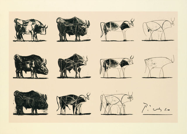
As Glaser puts it, “What is clear just from looking at this single print is that style is irrelevant. In every one of these cases, from extreme abstraction to acute naturalism they are extraordinary regardless of the style.” – Ten things I have learned, Milton Glaser
I thought this line of thinking was very interesting. Glaser makes the point that “Style is not to be trusted”. Or another way to think about that, is that style is fashion, and it comes and goes with the tide. In demonstrating that the style of the work is actually irrelevant to it’s quality, we could draw the conclusion that style in ap design (the aesthetic) is also irrelevant, except for one small problem…
Fashion is of utmost importance
Back in the early days of smartphones the designers at Apple had a clear design goal: Familiarize people with touchscreens. So the style was glossy buttons with shadows, and controls that seem like they want to be touched. If there was a real-world analogue that could be used to symbolically represent a 3D interactive object, they would use it. This is known as skeuomorphism in the design communities, and I won’t rehash why everyone decided they hate it in the past few years here. What I will say however is that there was value in those old ugly interfaces. What we were able to do with skeuomorphism is train users to use our apps with visual language. The best example I can think of from those days is the picker view (called a UIPickerViewController in programmer speak).
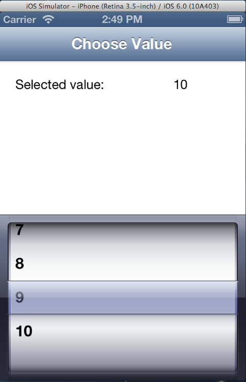
Nothing about the design of the picker view makes much sense, really. The only thing it does well is it looks like a spinning wheel, which encourages you to spin it like a contestant on The Price is Right. It’s kind of fun, in fact. But, this interface actually kind of sucks to use. You can only see about 4 or 5 options at any given time, and selecting a specific option requires a fine-tuning sort of interaction where you slowly and carefully align a value with the center of the view. A much simpler approach would be to just put options in a big fullscreen list; which is actually what Apple ended up using more often in their own apps. (Also known as a UITableViewController.)
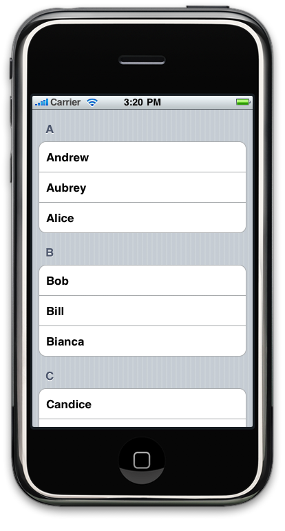
While these types of interfaces have many drawbacks, I have to wonder if my elderly friends, or my infant nephews would have been able to use smart devices so readily where they not using these metaphors for reality. Would smartphones have become as successful as they are now without skeuomorphism?
It wasn’t just this picker either, skeuomorphism informed the iBooks interface, designed to look like an actual bookshelf:

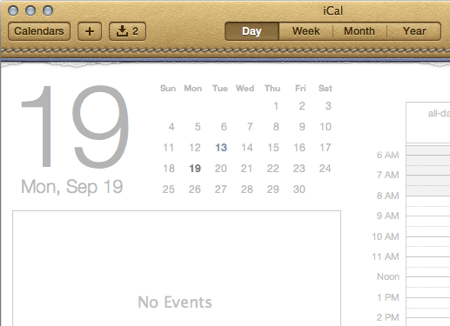
It inspired the Calendar interface, to look like an actual calendar:
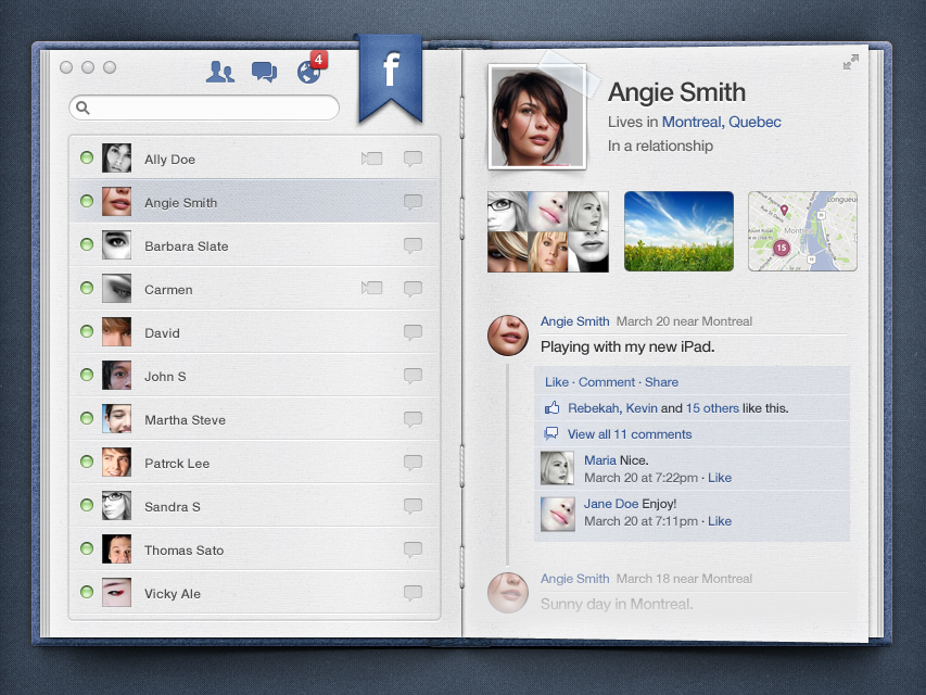
And just for fun: Designer Meng To posted this skeuomorphic version of Facebook that looks like an actual book. on dribble.com
2016
Fast-forwarding to 2016, we have completely abandoned the idea that people don’t know what to do with touchscreens. I think we actually have gone too far. Have you ever tried to use Snapchat? It’s like they have made it intentionally confusing to use. Everything is hidden using gestures and invisible buttons you are supposed to know to tap and hold, and weird things like that. Some of the apps most interesting features are completely hidden from view.
There was a lot of positive reactions to the app Clear from a few years ago. It was a huge hit because of it’s unique UI animations. But here’s my question: How many of those downloads translated in to regular users? I don’t want to sit here and hate on the Clear app because I think it was a brilliant design in terms of being unique and fashionable. What it was not however, is usable.
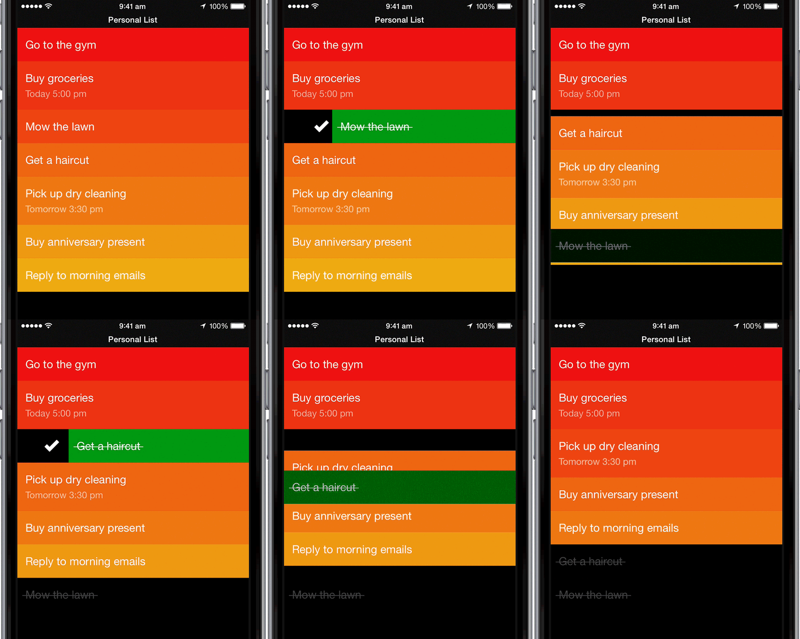
Okay, so I swipe to the right to finish a task… Oops wrong one, how do I undo that? Do I just re-add it? Wait, how do I add a task again? Oh, I take two fingers and separate two existing tasks, and that makes a new one appear in between my existing ones? That’s odd… what if I don’t have two tasks? Do I just sort of “unpinch” the negative space where my tasks would be if I had two?
Yep.
That’s exactly what you’re supposed to do, and that sucks…
To clear a task swipe to the left, to finish a task swipe to the right. Wait, what’s the difference? I’ve cleared some of my tasks, but deleted others. Either way they get removed from my list…
If you go look at the app store reviews for Clear, you’ll see a lot of people complaining about the same thing, and I can’t even fully explain it to you because I don’t understand it either. But apparently if you perform a swipe gesture up (or down?) it will delete the entire list. How’s that for a fun and wacky gesture! So fun! You just lost your entire task list, which is the entire point of the app! That dismiss animation was sick though, so the app must be great, right?

The tutorial for Clear says I should “Pinch together vertically” to collapse my current level and navigate up. So instead of tapping a back button to navigate up, I have to perform a two-handed unpinch gesture for that too? I thought that was the gesture for creating a new task? HOW DO I USE THIS APP I DONT UNDERSTAND!? ARGGGH!!
deletes app…
Fashion sucks
As disappointing as it is, this seems to be the new fashion in apps: I summarize it basically as intentionally terrible user experience. I was talking to a prospect recently about an iOS App we were planning to help them build. They showed me a mockup that involved quite a few hidden buttons and gestures to control the UI. I carefully explained that users were unlikely to find these gestures and that we should move these things in to buttons that are more obvious. As a compromise, we needed at least a quick tutorial to show them these features. The response I received was surprising, to say the least:
We want this to be a secret |
If we were designing a video game level this would maybe make some sense. It’s typical to “hide” some areas of play so that it’s rewarding when they are discovered. And if it’s a word game, like Word Villa, then the reward could be some Word villas answers. This is basically what they were going for. But for a mobile app, this is just a poor UI decision that is going to leave people confused. This wasn’t some kind of special easter egg hidden feature. This was basic functionality for switching to a friends list in the app.
You want to hide the friends list from users? This kind of thinking is now fashionable. Whether we like it or not, fashion influences the way we write software. As someone who is going to spend hours of my life building out these features, I hate the idea that most users simply will never find them. That’s why I declined that particular project. I left money on the table, but saved myself from spending time on work I didn’t find meaningful.
It’s our responsibility to fix it
I could sit around critiquing popular app’s designs all day (and I might), but this post wouldn’t be much use to anyone if that was all I did. So, let’s talk solutions…
1. Recognize that you can fix things
First, I think it’s important to accept that application developers have the final say in what their work ends up producing. You may think the decisions are simply made by your client, your boss, your partner, or your dog. Blame who you want, but your apps are the output of your efforts. If you are being boxed in to a corner and being asked to do something that sucks, you should stand up against it. You should learn to say “no” more often. At the end of the day, if you deliver what you think is best to solve the problem at hand, and you do your best work, no-one can complain about that. If they do, then they’re probably not worth working with anyway.
2. Do hallway testing
Hallway testing is the kind of testing you do when you grab some random person “out of the hallway” to test your app. You may have NDAs or similar agreements that make this a challenge, which is why it’s important to make sure agreements like this permit hallway testing. You may not be able to place an ad and have dozens of testers come to your office, but you can at least get family member or friend to try things out.
There are two very important aspects to hallway testing that are required for it to work. The first is that you absolutely can not explain things to the user while testing. It will be your first reaction to want to explain away any rough edges, defend your work, or try to help move things along to avoid embarrassment. This no longer represents a real hallway test though, this represents what it would be like if every user of your app was accompanied by you with your explanation, which obviously is not happening.
The second thing you must do is take notes of any stumbles. If you watch a user struggle with a component of your app for several minutes, and then finally figure it out, you could very easily write it off and say “oh well, they eventually figured that out so it’s not a priority”. WRONG! Your testers will have infinitely more patience than real-world users. If a tester is struggling, you need to make a note of it. Make several notes in fact, you’re going to forget if you don’t, and then those issues won’t be addressed.
3. Don’t hide anything inside of non-obvious gestures
If you are making a feature that involves swiping, pinching, or any other gesture, you should make sure it actually is intuitive to do so. For example, panning on a map (like an Apple Map) is very intuitive… it’s obvious that you would want to scroll the view and it’s obvious how you would go about doing that.
You’ll have to use your judgement on this one, but one way to confirm that your gestures are clear is by doing hallway testing, as mentioned above. You can trust your instinct with this stuff, but you also need to confirm you were right. Often something that seems intuitive to you will not be obvious to your testers.
4. Don’t be clever
There’s a famous quote often cited in software development projects.
Everyone knows that debugging is twice as hard as writing a program in the first place.
So if you’re as clever as you can be when you write it, how will you ever debug it?
“The Elements of Programming Style”, 2nd edition, Chapter 2
The same thing applies to user interface design. If it was a really clever idea, you should always be wary. Often the dead-simple obvious solution is the best one. This is basically just Occam’s Razor restated, which is often quoted for a reason: it’s true.
There are still many mobile companies that rely on dedicated java developers to develop web design softwares that are still in use at various places. Find reliable and secure cloud native applications at TechFabric.io.
5. You tell me
What are the other takeaways here? How do you make sure your apps are highly usable? Tell me in the comments or on Twitter.
P.S. As an interesting side note, “The Bull” is also reportedly the subject of Apple’s training materials on their design thinking, for entirely different reasons.